Contrast That’s Comfortable to Read
Low contrast may look minimal or “modern,” but it sacrifices readability, especially for users with low vision, color blindness, or who are just reading in sunlight.
WCAG defines clear, testable minimum contrast ratios to ensure your text and UI are legible for everyone.
Good Practice
For text:
- Normal text (under 18pt regular or 14pt bold):
Must have a contrast ratio of at least 4.5:1 - Large text (18pt+ or 14pt bold and up):
Must have at least 3:1
For UI components and graphics (non-text elements):
- Interactive controls, borders, icons, etc. must meet 3:1 contrast ratio against adjacent background or surrounding elements.
This includes:
- Input borders
- Focus indicators
- Toggle icons
- Button outlines and text
Example (bad):
/* Low contrast text on light gray */
color: #aaa;
background-color: #fff;
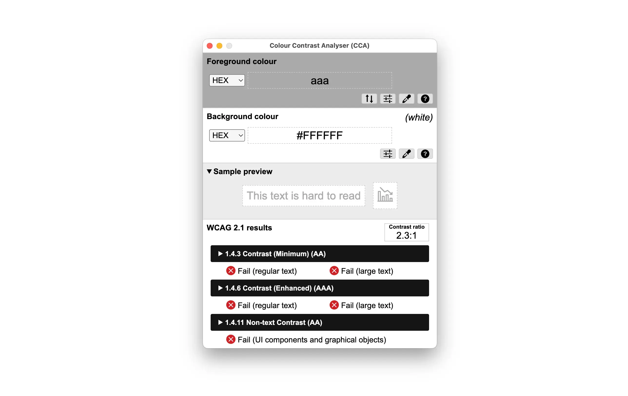
With that combination, we get an insufficient contrast ratio (2.3:1).
Better:
color: #333;
background-color: #fff;
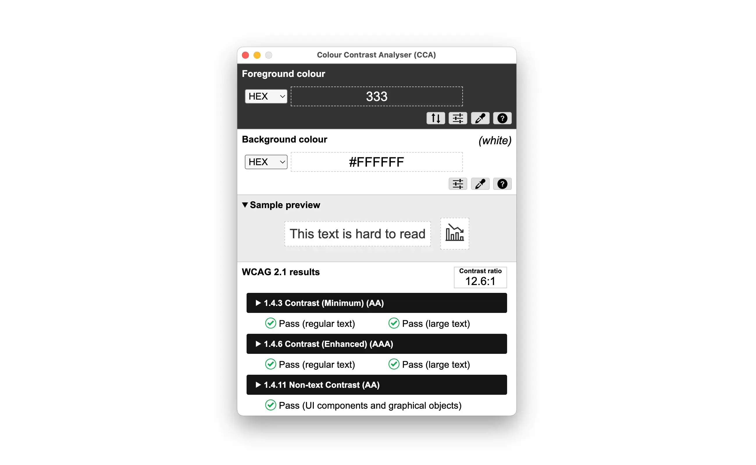
This combination achieves a contrast ratio of 12.6:1, which passes WCAG guidelines.
Use color contrast tools to measure, our eyes can’t reliably tell what passes.
Watch Out For
- Text on gradients or images with poor contrast
- Buttons with faint borders or text
- Focus states with subtle outlines (especially in light mode)
- Hover/focus states that reduce contrast for stylistic effect
Pro Tip
Don’t just check your default state! Validate contrast for hover, focus, disabled, active — all visual states should pass.
Even animations or transitions should maintain contrast while changing (e.g., don’t fade to near-invisible colors on hover).
There are many free tools to check color contrast. I am a big fan of the Colour Contrast Analyzer by TPGi, which is the app used in this post. It is available on Windows and Mac for free.
The following tool is a small tool that I created to help generate accessible color palettes: Accessible Color Palette Generator. It helps you create color palettes that meet WCAG contrast requirements by suggesting color combinations that pass the necessary ratios. I keep updating it with new features, so feel free to check it out, or contact me if you have any suggestions!
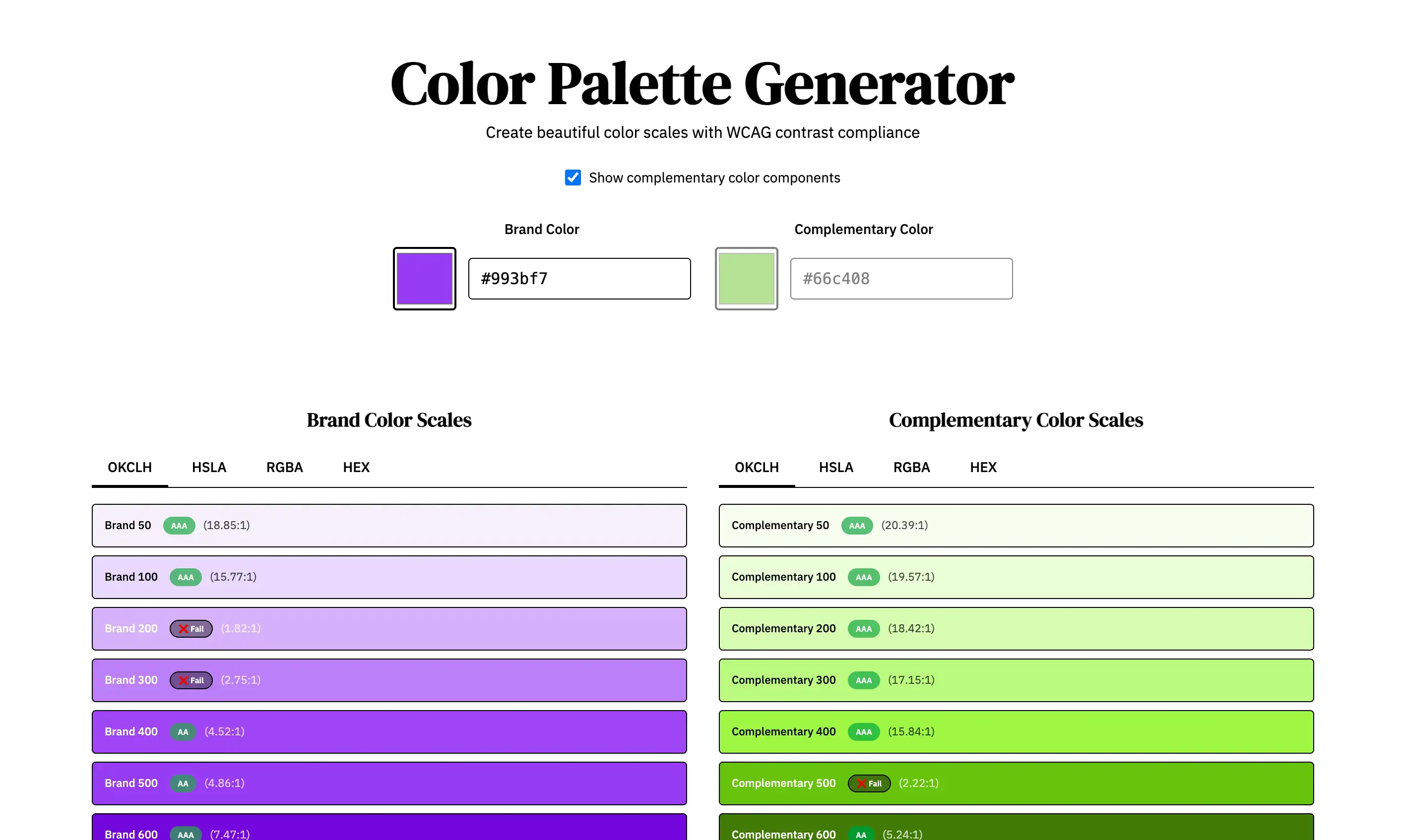
Tools like this can help you generate accessible color palettes.
Do this today: Pick a page and run a contrast test using one of the tools above. Look at body text, labels, input borders, links, and buttons. Check all states. Adjust your color palette or use opacity or layering tricks only if contrast still passes.
Will this change in WCAG 3.0?
This is the current WCAG 2.2 standard. WCAG 3.0 (still in working draft) proposed in previous versions (and then removed it) to use something different called Accessible Perceptual Contrast Algorithm (APCA), which consideres Lightness Contrast (Lc) instead of simple contrast ratios. Instead of getting 4.5:1, we would get a value of 72 Lc for example, meaning the text is comfortably readable. However, WCAG 3.0 is not yet finalized, so for now, it’s best to stick with WCAG 2.2 guidelines.
Here you can find an example of how it might work.
APCA Contrast Checker
| Usage | Min Lc | Result |
|---|---|---|
| Body Text | 60 | — |
| Large Text | 45 | — |
| UI Labels | 30 | — |
| Decorative | 15 | — |