Don’t Rely on Color Alone
Bonus Shoutout
Today (Dec 11), I’m also featured in Manuel Matuzovic’s Advent Calendar — talking about Math and Accessibility. Check it out!
Color is a powerful design tool. However, it can’t be the only way users understand meaning.
Roughly 1 in 12 men and 1 in 200 women have some form of color vision deficiency. That means using only red, green, or other colors to indicate status, categories, or required actions leaves many people out.
If success is green and error is red — how will someone who can’t see red or green tell the difference?
Good Practice
Pair color with another cue:
- Text (e.g. “Success” / “Error”)
- Icon (✅ ❌ ! ⚠️)
- Shape or underline
- Position or layout
- Pattern or texture (in charts or graphs)
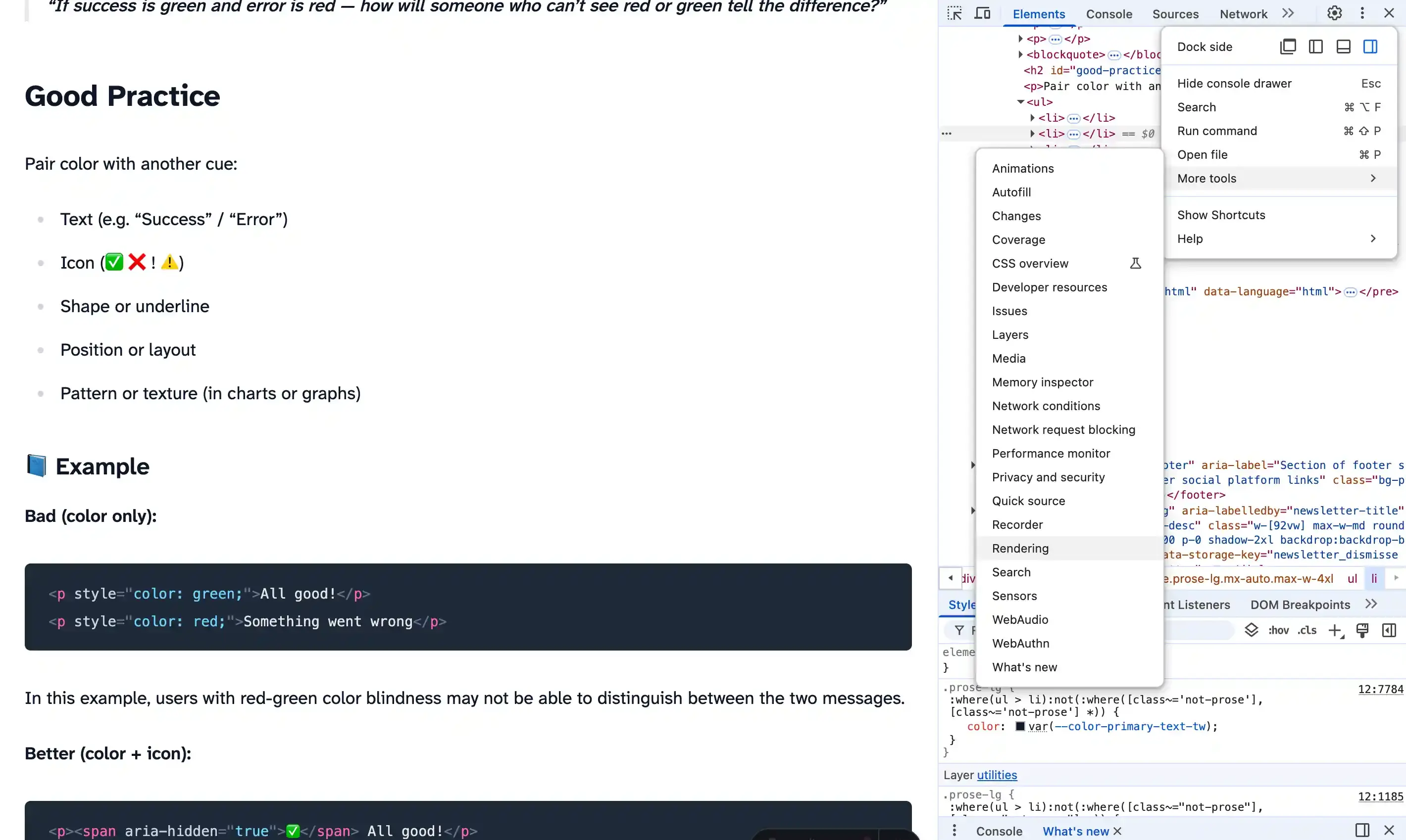
Example
Bad (color only):
<p style="color: green;">All good!</p>
<p style="color: red;">Something went wrong</p>
- All good!
- Something went wrong
In this example, users with red-green color blindness may not be able to distinguish between the two messages.
Better (color + icon):
<p style="color: green;"><span aria-hidden="true">✅</span> All good!</p>
<p style="color: red;">
  <span aria-hidden="true">❌</span> Something went wrong
</p>
All good!
Something went wrong
Watch Out For
- Form errors shown only in red with no text or icon
- Charts using color-coded lines or bars without labels or patterns
- Buttons or tags that rely solely on color (e.g. green = “active”, gray = “inactive”)
- Required fields marked only with red borders
Pro Tip
Take a screenshot of your UI and apply a grayscale filter in a graphics app or browser dev tools. Can you still tell the difference between statuses, categories, or data series?
Chrome also has a built-in color vision simulator in DevTools → Rendering → Emulate vision deficiencies.
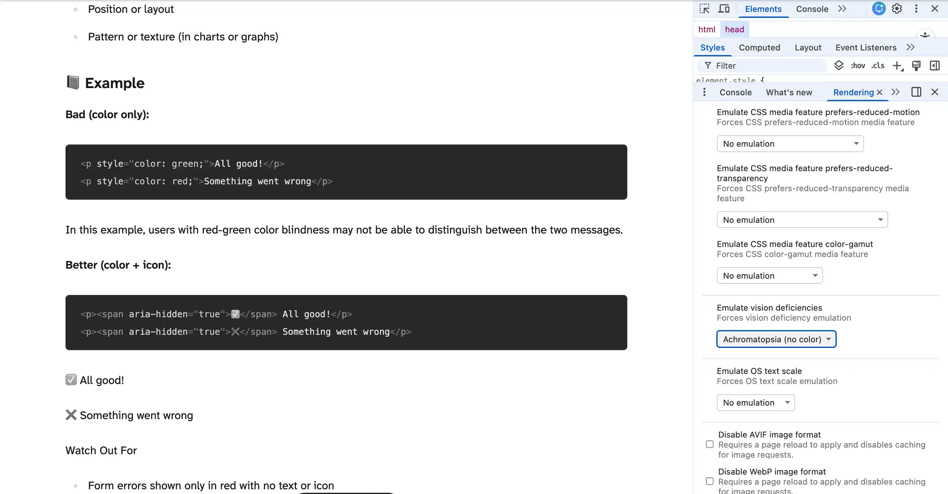
You can emulate different types of color vision deficiencies to see how your design holds up.
Do this today: Review a chart, status badge, or form on your site. Can you still tell what’s what in grayscale or colorblind mode? If not, add an icon, label, or shape to make the meaning clear.